Mobile Last: Making This Website Mobile Friendly
Wow so responsive. No, I think that’s adaptive. You can really tell they designed using mobile first! Ooh yes, progressive advancement is sooo much better than graceful degradation!!
What do all of these words mean?? And why are they important? Three days ago I had no idea. So in this post, I’ll explain the importance of those bolded terms and how I (mostly) achieved them. They help explain how the mobile version of this site went from having a small header, and being cramped and hard to read:
To being much cleaner:

Mobile First
Of the words I bolded, mobile first is one of the most popular. Simply put, it’s a design practice where the mobile version of a website is created first. Then, in a process called progressive advancement, the desktop version is built by adding to and modifying the mobile version. Sometimes that progressive advancement won’t happen and the desktop version will be made independently from the mobile version - but usually not.
While reading around, I’ve seen two good reasons to develop mobile first. First, mobile usage on the web is quickly growing compared to desktop usage:
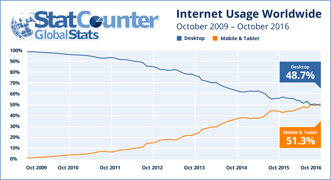
This data suggests that in the future or even now, the mobile version of a website is more important than the desktop version.
The second reason for mobile first is that developers may do a worse job on the mobile site if it’s done second. That’s what happened to me - I’m used to creating desktop websites, so I initially did the bare minimum to ensure this website was readable on mobile devices.
Mobile Last
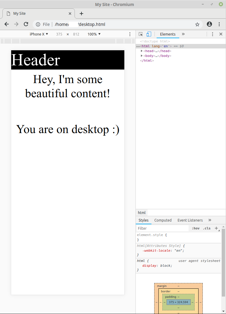
Mobile first sounds good and all - but wait, didn’t I name this post “Mobile Last”? Unfortunately I didn’t know about mobile first when building this website, so I had no choice but to resort to the opposite of progressive advancement - graceful degradation. This is when the mobile version of a site is built by stripping features from the desktop version. Here I’ll show a quick example of how that works. I’ve written a very basic desktop website - feel free to download it and open it with your favorite browser: It looks like so:
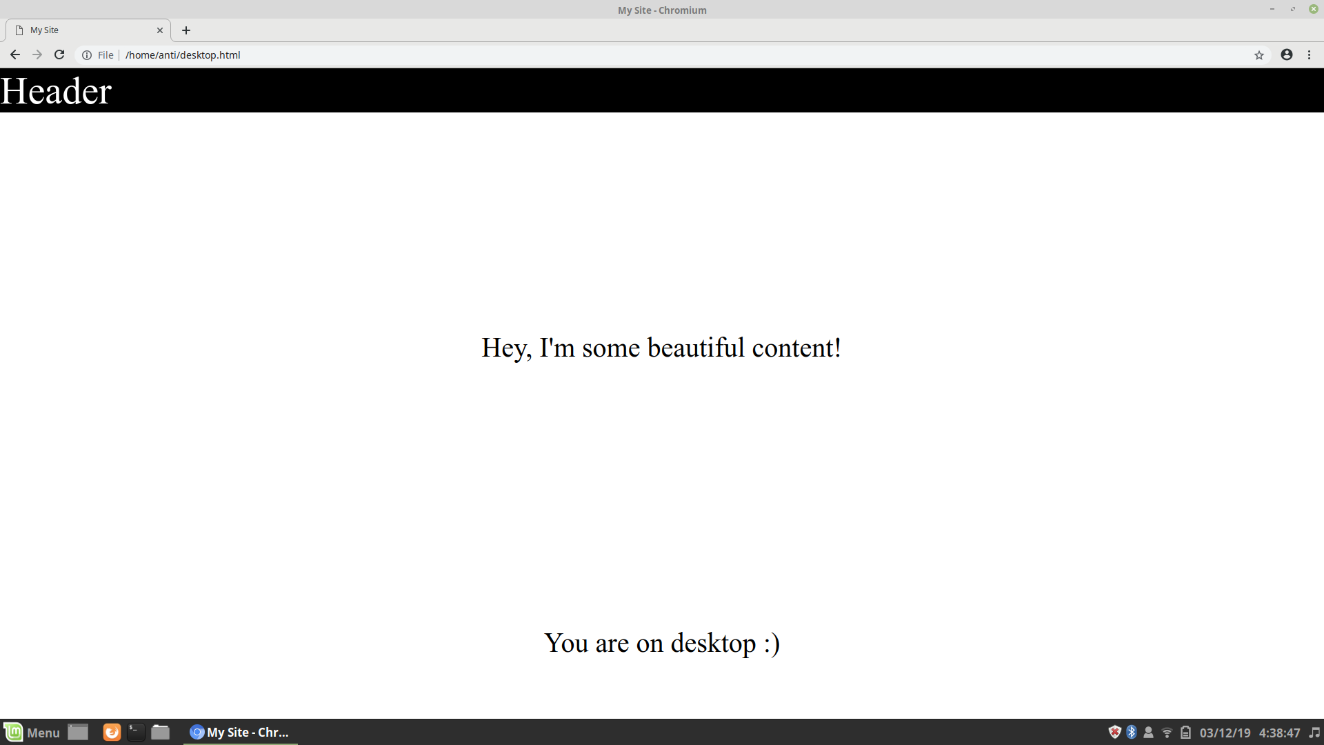
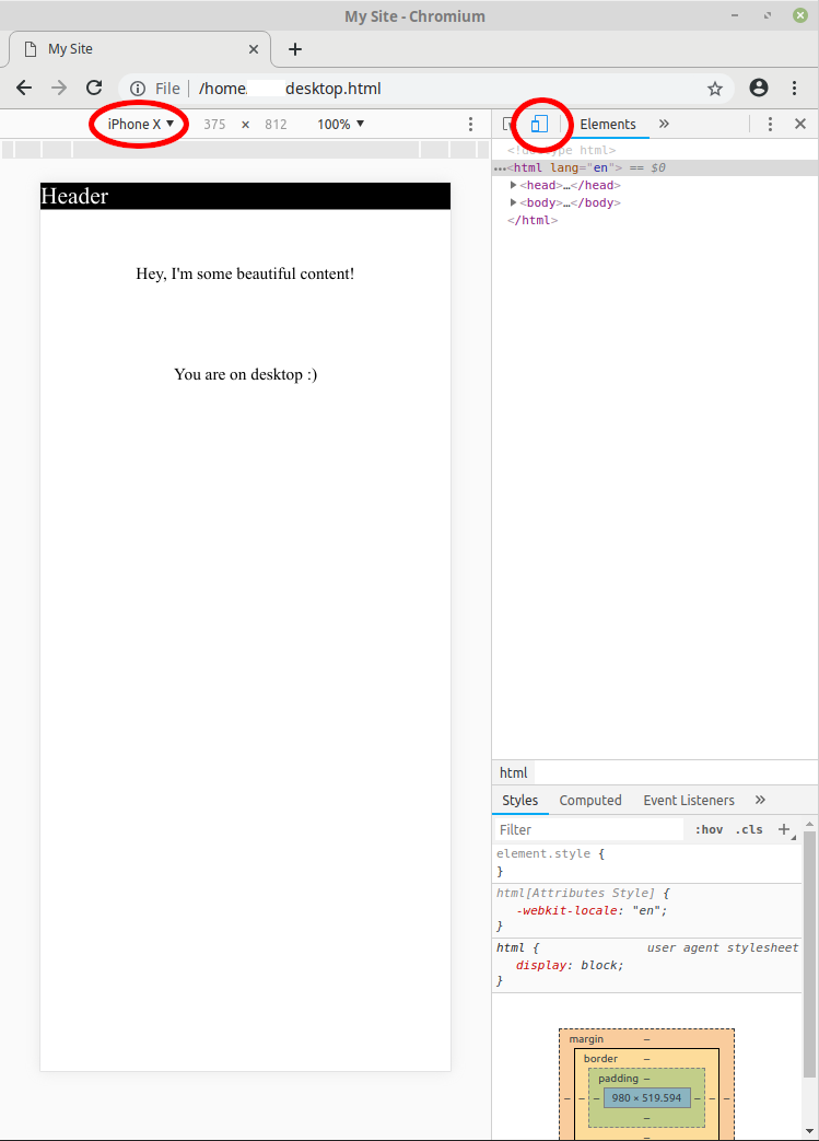
Unfortunately, issues become apparent if I inspect element, toggle the device toolbar, and then choose “iPhoneX” to see what the website looks like on a phone. The website doesn’t scale well as the black header is way too small, and desktop content is still displayed.
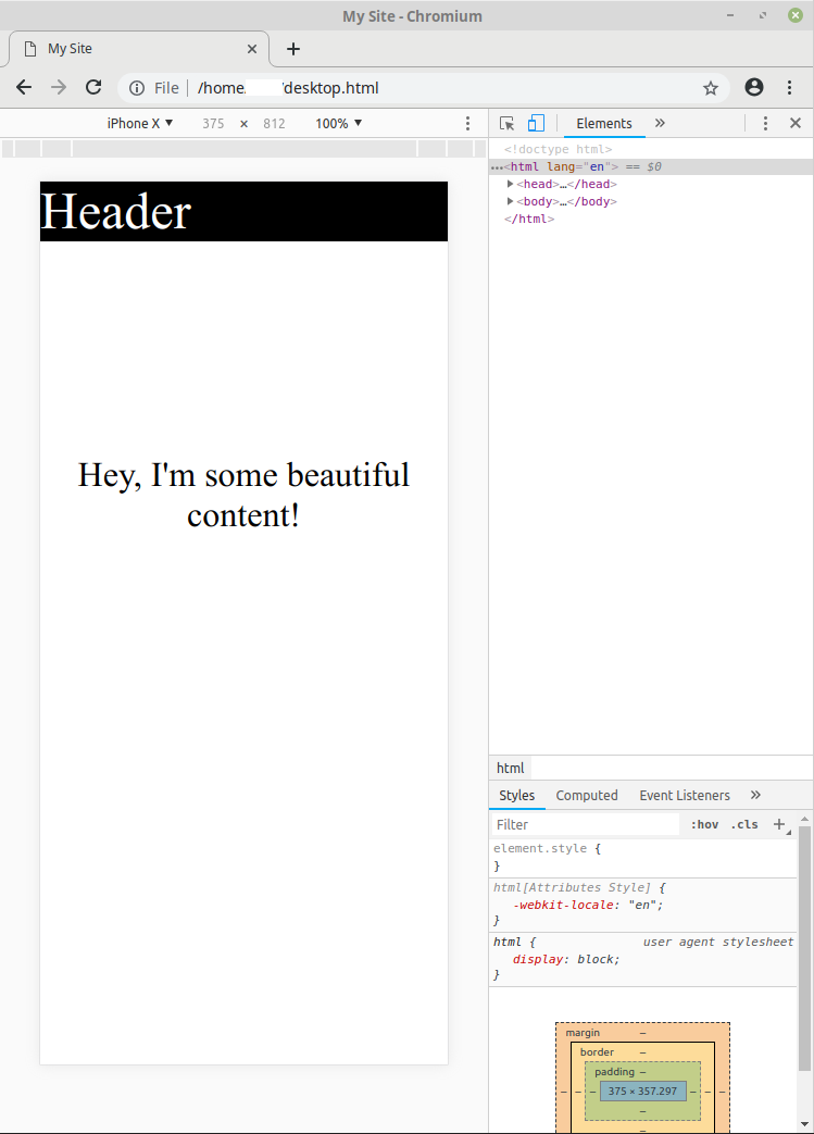
The scaling problem arises because phones simply zoom out to view large webpages. To prevent this, we need to add the following line between the head tags of the website code:
This tells mobile browsers that the width of the device should be the width of the webpage, as opposed to scaling the page. Here’s the improved version:
That’s covered one issue - but what if we want the page to look substantially different on mobile devices? The header font size should be smaller, the content should be more centered and smaller, and the desktop notification should be gone. That’s where we can use media queries at the end of our CSS, like so:
With media queries, certain CSS code is only run in certain situations. The only screen part of the query ensures that the extra styling is only applied when viewing the website on a screen. If screen was replaced with print, the code would be run when the website is being printed. The (max-width: 420px) part of the query tells the browser that the code should also only be run if the page width is at or below 420 pixels - which is a large enough range to include most phones.
Inside the query, I’ve made spacing and size changes, and hidden the notification that the user is on desktop.
Here’s the final version:
And here’s the updated code:
This is how I made my website more mobile-user friendly - with media queries. Note that if I had practied mobile-first design, the initial CSS would have been for the mobile version, the media query would have been for min-width instead of max-width, and the CSS inside of the query would have been for scaling the website up for desktops.
Responsive Versus Adaptive
The previous example website I created is adaptive. In an adaptive website, at certain sizes the website will make sudden changes. This is seen in the example website as sudden changes occur when the width crosses 420 pixels. In a responsive website, small changes in the width of the screen result in small changes in the website as content shifts around to fill up space. If the text size were 20vw (20% of the view that a user sees), then the content would change size to match the width of the website, and the website would be responsive. I’ve made that change here - note how the content text shifts its size:

Summary
In summary, mobile-first websites tend to neglect neither desktop nor mobile devices, and their desktop versions are created using progressive advancement. On the other hand, Mobile last websites use graceful degradation to create the mobile version from the desktop version. Both mobile-first and mobile-last websites can be created using adaptive techniques where the website changes suddenly, and/or responsive techniques, where content fills up whatever room is available. In either case, media queries are super useful in changing website behavior based on screen size.
Hopefully this article has helped you better understand mobile design. I did a good amount of research and borrowed a lot of ideas for this article, so if you want to learn more, check out any of the sources I used:
17: How to Make a Website Responsive | Learn HTML and CSS | HTML Tutorial | Basics of CSS (youtube)
Adaptive vs. Responsive Design
What is Mobile First Design? Why It’s Important & How To Make It?
Understanding the difference between mobile-first, adaptive and responsive design
| Back to Project |
Get occasional project updates!
Get occasional project updates!